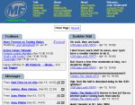
 We here at FHDC Corp care about you! That's why we've invested millions of dollars into our R&D department to bring you a new layout. It's the same as the current layout, except the navigation is on the top, not the side. This makes it nicer on narrow browsers. Click the picture over to the right of this to see a sample. You can try it out yourself from the theme page.
The question: should this become the default FHDC theme? Discuss amongst yourselves. We thank you for using FHDC, and wish you a pleasant and fruitful day.
If you could frame the top menu so that it doesn't move when you scroll, it would work better for me. I like to have those menu options available all the time.
So for now, I am still using the standard theme.
yeah, i'm not real into stationary framed navigation :)
To each his own. My old Rutgers Football page had frames everywhere. Pissed some people off, but too bad!
But then again, it pissed no one off, since no one cared enough about Rutgers football to take a look. Feh.
a fixed side frame with all the goodies would be nice for those long long long forum pages.
See, THAT I would use.
If I'm going to use a top menu, I'd like it fixed... but.... I wouldn't use that.
The side, on the other hand...
It would kick ass!
It's much like always having, oh, I dunno, back/forward/refresh/stop buttons. It should be a given.
(granted, I use keyboard shortcuts for all of those.. but... you get my point)
If you're going to have a menu bar... have it fixed while the content scrolls.
(or, rather, have that as an option)
Just my $.03
;)
ack! Topframes=evil!
I tend to have a lot open in little windows, and if the window is little the frame still takes up the same amount of space. (ie: half of my view is of the menu, even when I don't need it).
Although, I might just be biased because of growing up on text-only internet well past its prime.
Frames are evil in the book of Talcott
(although, if there could be a framed option for those who wish for such things, that'd be good)
Like! This works for me a lot better than the current default... I'd been using classic layout because I like having the links at the top so that the frumessages and wall are less squished. I definitely like this.
I prefer the default the way it is. i use the original for nostalgic reasons sometimes, but mostly i use the default. my screen is plenty wide, so the navigation on the side doesn't bother me, and i see new content quicker since I tend to look at a page top down. i think it probably keeps me on the page longer the way it is now.
I like the new layout. Just a suggestion though... since Birthdays is available as a tab that you can place where you want to on your page you should "detach" it from the Headlines box....
That wouldn't be very easy, unfortunately. What you can do if you don't want the "FruNews" module intact, is to just use the "Site News" module (which is news without the forums or bdays).
I actually prefer them on the side.
yeah, I'm to the side camp, but that's also because of the way I tend to have FHDC open.
Usualy, I have the power-wall open on full screen, and then a bunch of other windows (both on fhdc and elsewhere) tiled about.
That said, so long as side and top are both options, I don't think it matter too much what the defult is.
Check out the Zwan website for a lesson in busy, eye searing, mind numbing web page design.
Ack! Why would you ever, ever post that link anywhere?!?!
:P
Eri
 · 22 years, 5 months ago
I LOVE IT! *lol* Nah, as a novelty, it's cool. And Zwan.. well, you know, it's more Billy. Yum.
wow. that is pretty, erm, wow. *stunned* :D
I like the current layout. One advantage of putting the menu on the side is it makes it easier to add more items.
The one suggestion I'd make is to lose the tabs.
The things that look like tabs but aren't like "Recent Diary Entries."
You must first create an account to post.
|

 We here at FHDC Corp care about you! That's why we've invested millions of dollars into our R&D department to bring you a new layout. It's the same as the current layout, except the navigation is on the top, not the side. This makes it nicer on narrow browsers. Click the picture over to the right of this to see a sample. You can try it out yourself from the theme page.


